ADVANCED TYPOGRAPHY - TASK 2 : KEY ARTWORK AND COLLATERAL
21.09.2022 - 12.10.2022 (Week 5 - Week 9)
Christie Angelica Bakhary / 0350655
Advanced Typography / Bachelor of Design in Creative Media
Task 2 : Exercises
LECTURES
Lecture 5 (Week 5)
Perception and Organisation
Contrast
Rudi Ruegg

|
|
Fig 1.1 Ways contrast can be applied in typography (Source: Lecture slides) |
According to Rudi Ruegg, contrast can be created in typography by
changing weight, font, style, size, colours and typeface.
Carl Dair
Carl Dair has a slightly different explanation on how contrast can be
applied in typography.

|
|
Fig 1.2 Contrast in typography based on Carl Dair's
explanation (Source: Lecture slides) |
Size
Contrast using size in typography means to direct the viewer's attention
to the word that is big in size.
Weight
Contrast using weight in typography is made by creating a heavy weight
within a text, it can be created using bold weight or using
non-objective elements.
Form
Contrast in form is created by changing the style of the text, from
roman to italic.
Structure

|
|
Fig 1.3 Example of typographic poster using structure for
contrast (Source: Claire Heffer's Blog) |
Creating contrast using different types of typefaces.
Texture
|
|
Fig 1.4 Poster using texture for contrast (Source: Sarah A. Farr's Blog) |
Texture refers to the way the lines of text look as a whole from up
close and from far away. Texture can be created by using different sizes
and weights.
Direction
Creating contrast by changing the direction of the text, either it be
horizontal or vertical.
Colour
Creating contrast using different colours. It is important to consider
the number of colours used and where the colour should be used to create
hierarchy.
Form
Refers the overall look and feel of the elements that make up the
typographic composition. A good form in typography is able to lead the
viewer's eyes and visually interesting.
An integration of meaning and form can bring a balanced harmony of
function and expression. When a typeface is perceived as a from, it no
longer be perceived as a letter.
Organization/gestalt
Gestalt theory emphasizes that the whole of anything, that is, the
complete form of a design, is greater than the detailed part of it. Thus
in design, a design is only considered a good design if it is visually
interesting and appealing as a whole.
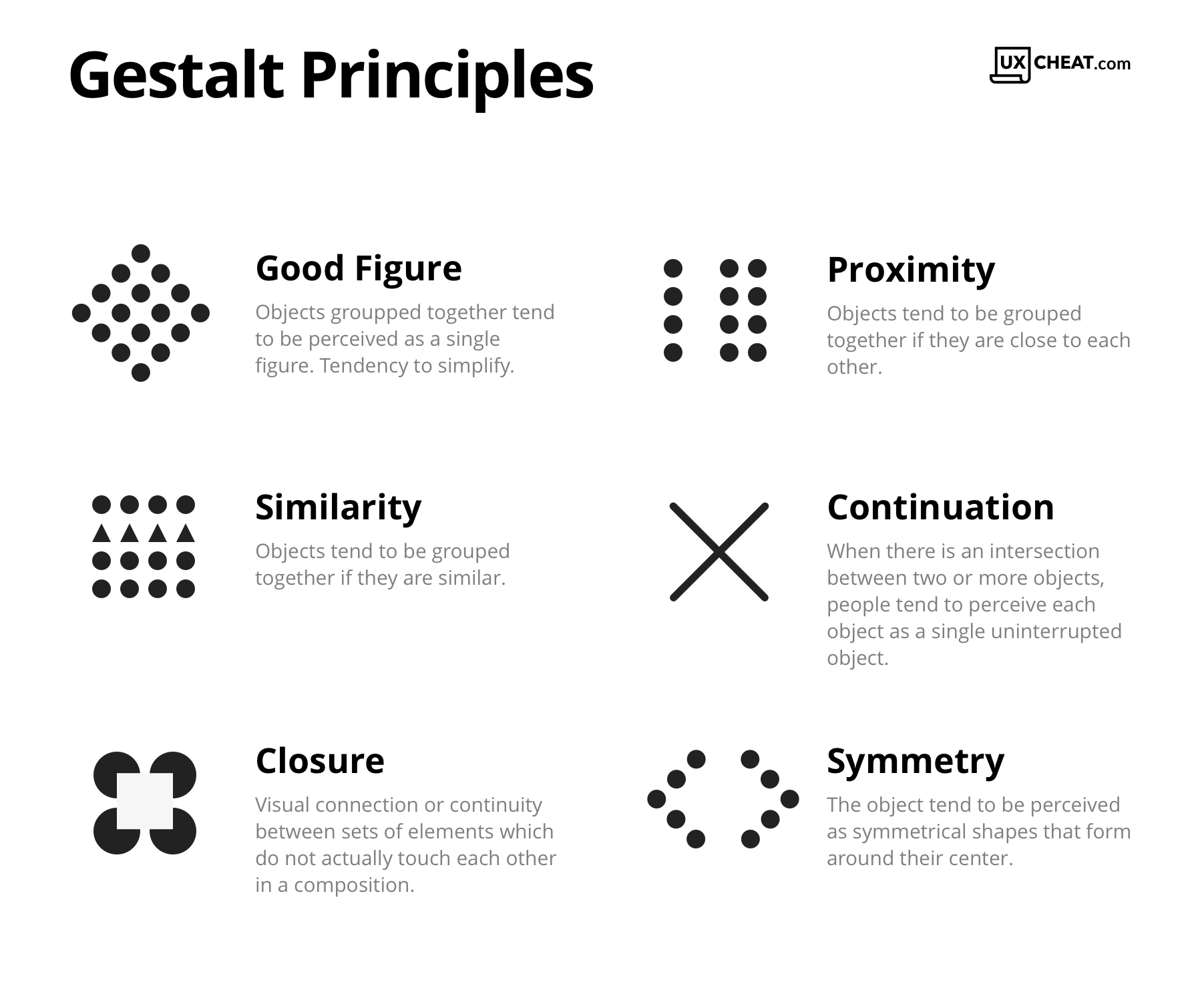
|
|
Fig 1.5 Gestalt theories (Source: Public Health Nigeria website) |
Law of similarity
Elements with similar characteristics will be seen as a group of
one.
Law of proximity
Elements which are closer to each other in distance will be seen as a
group of one
Law of closure
Refers to how human minds would complete gaps present in an image
Law of continuation
Refers to how human minds perceive two or more elements as different
groupings, even when the elements intersect each other.
Law of symmetry
Refers to how elements that are symmetrical to each other are tend to be
perceived as one grouping.
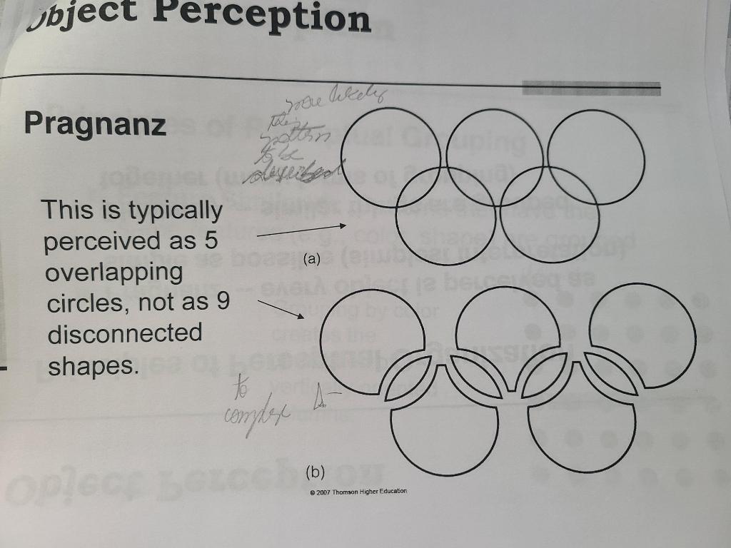
Law of Pragnanz (Referenced from: Adam Fard Blog)
|
|
Fig 1.6 Example of law of Pragnanz (Source: Chegg website) |
Also known as Law of good figure. Refers to how human minds tends to
perceive complex shapes in the simplest manner possible. In other words,
our brains find it less taxing to process simple shapes.
INSTRUCTIONS
PRACTICAL
Task 2A : Key Artwork
For this task, we're to design a key artwork taken from our initials name, where we should also consider and think of what occupation will we do if we weren't a designer while creating the logo.
Idea Exploration and Sketches
 |
| Fig. 3.1 : Key Artwork Sketches |
The sketches I made were various and different to each others as I am exploring towards different references here.
First one were more of a modern-minimalistic style, which suits with the first occupation I'm thinking of, a fashion designer or a fashion stylist. Next one, not really sure about what job it leads to, but an artist may be suitable for it. While for the third one, yogurt stall was the one I'm thinking of while making the logo.
After getting a feedback from Mr. Vinod, I decided to digitize and went with the first and the fourth one. However, after digitizing it I realized that it was too simple and not suitable with the one I want/expect.
So, I went to search for some more inspirations from Pinterest and do another attempt with 'c' and 'b' initials. As I finished sketching, I decided to went further with this logo as it already match with my own expectation and style.
 |
| Fig. 3.x : Another logo sketch attempt |
Digitization and Coloring
For the coloring and poster theme, I wanted to do a chrome type effect, which I was inspired by of Aespa's Savage album logo, one of a K-pop girl group's music album.
 |
| Fig. 3.x : Aespa 'savage' logo (Source : Pinterest) |
 |
| Fig. 3.x : Applying chrome effect to the logo |
To make the logo more alive and realistic, I add some sparkles and outer glow effect to it.
 |
| Fig. 3.x : Adding some sparkles |
.jpg) |
| Fig. 3.x : Before-After adding sparkles |
 |
| Fig. 3.x : Key Artwork Final Outcome Uncolored Ver. (JPG) |
 | ||
Fig. 3.x : Key Artwork Final Outcome Colored Ver. (JPG)
|

Fig. 3.x : Key Artwork Final Outcome (PDF)
Task 2B : Collateral
For part B task, we're required to create a poster and minimum one collateral using the previous key artwork we've made in task 2A.
Poster
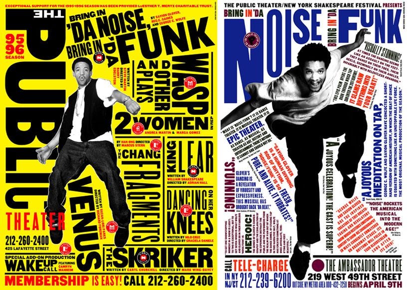
Visual Research
Layout
Collateral 1 - ID Card
 |
| Fig. 3.x : Collateral Final Outcome (JPG) |
Fig. 3.x : Collateral Final Outcome (PDF)
FEEDBACK
Week 6
General Feedback :
When making a mark, we should care if it fits in a square shape. Good mark design is stable, simple, communicable, understandable, and symmetrical. When arranged in a grid, it is easier to handle if it is closer to a square.
Week 7
General Feedback :
Clarify the purpose for which the logo exists. Logos are meant to articulate identities, such as a person or brand image. Some designs called responsive logos, change shape in stages depending on size. Regulations need to be established.
Week 8
ILW
Week 9
General Feedback :
Students should not use too many objects in the 9 posts that are not related to the key artwork.
Students should not use too many objects in the 9 posts that are not related to the key artwork.
REFLECTION
Experience
I had the chance to research on my typeface name logo design and branding as well as learn about typography as part of this assignment. I'm especially interested in creating logos
FURTHER READING


Comments
Post a Comment