PUBLISHING DESIGN - TASK 1: EXERCISES
03.04.2023 - 25.05.2023 (Week 1 - Week 8)
Christie Angelica Bakhary (0350655)
Bachelor of Design (Hons) in Creative Media / Publishing Design
Task 1: Exercises
INSTRUCTIONS
LECTURES
Iran-Iraq: Mesopotamian Civilisation
"Record Keeping Before Writing" by Denise Schmandt-Besserat (1995) argues that the earliest writing system emerged from a counting technique. From basic and complicated tokens to bullae came pictographic writing on clay tablets.
 |
| Figure 1.1: Clay tablets (3000 BC) |
 |
| Figure 1.2: Palm leaf manuscript from Nepal (2600-1500 BC) |
 |
| Figure 1.3: Papyrus paper (1600 BCE) |


The first printed book: Diamond Sutra 868 CE
The first printed book is from the Tang period. An accurately dated paper was found in Dunhuang in 1899. Paper scroll. In 179-41 BCE, the paper was developed.

Printing the Diamond Sutra from wood blocks is laborious. Chinese printers are amazing. In the 10th and 11th centuries, all the Confucian classics are published for scholar-officials, along with thousands of Buddhist and Daoist scrolls and all of Sima Qian's Standard Histories. Carving that many letters in reverse on wood blocks are a laborious process before moveable type. This concept was again started in China but completed in Korea.
Europe (Turkey & beyond): European Civilisation
197-159 BC, Turkey created parchment, which migrated to Europe. Animal skin makes parchment. Papyrus and bamboo could be made into scrolls, but the leather was too heavy. Europeans made parchment books about 50 AD.


Paper made its gradual trek west from China via Persia-Arab dynasties and then through Turkey to continental Europe. 1400-1500 CE: Paper becomes common throughout Europe. The Boston Weekly Journal initially used wood pulp in the 1860s.
While paper arrived late, the folding format took root in 'the west' about 1900. First with wooden blocks sewed together with thread, then with parchment, and then with paper.
.jpeg)

Korea and Japan: AD 750-768
East Asian Buddhists invented printing. Korea wins. The first written text is a Korean sutra from AD 750.
 |
| Figure 2.2: Dharani sutra exhibited at the National Museum of Korea |
In Japan, a daring mass distribution attempt follows. In AD 768, in Buddhist Nara, the emperor orders a large edition of a prayer. The endeavor takes six years, and a million copies are made for pilgrims. Many have survived.
 |
| Figure 2.3: Hyakumantō Darani (One Million Pagoda Charms) |
The First Printed Book: AD 868
The first printed book is from the Tang period. It was discovered in a cave near Dunhuang in 1899 and accurately dated its production.
|
| Figure 2.4: Frontispiece of the earliest dated printed book, the Diamond Sutra |
It is a 16-foot scroll made of glued-together paper sheets. The scroll's first page contains the Diamond Sutra. It is the world's first printed illustration depicting an enthroned Buddha surrounded by holy attendants.
Chinese Publishing: 10th - 11th Century
Printing the Diamond Sutra from wood blocks is laborious. Chinese printers are amazing. In the 10th and 11th centuries, all the Confucian classics are published for scholar-officials, along with thousands of Buddhist and Daoist scrolls and all of Sima Qian's Standard Histories. Carving that many letters in reverse on wood blocks is a laborious process before moveable type. This concept was again started in China but completed in Korea.
Movable Type: From the 11th Century
Before printing is an effective way to disseminate information, movable type (separate ready-made characters or letters) must be created—11th-century China experiments with the notion. The experiment is impractical for two reasons. Chinese script contains so many characters that typesetting is complex. Chinese printers cast their letters in clay and burn them like pottery, a too-fragile medium.
Type Foundry in Korea: C.1380
The Koreans produced bronze moveable type in the late 14th century, decades before European printing. Unlike previous Chinese efforts with earthenware, metal may be repeatedly printed, dismantled, and restored. Koreans use Chinese writing; hence they have a lot of characters. In 1443, they created the Hangul alphabet. By a remarkable historical coincidence, Gutenberg is experimenting with moveable type in Europe, which has had an alphabet for more than 2000 years.
Saints and Playing Cards. AD C.1400
In 1400, six centuries after its inception in the east, Europe adopted woodblock printing. As in the east, pictures are produced by rubbing a sheet of paper against a carved and inked block. As in the east, pilgrims buy sacred icons. Western commerce also included playing cards. German developments in the 15th century turned printing from a cottage industry to a cornerstone of western civilization.
 |
| Figure 2.5: (left) Chinese playing card found near Turfan, 15th century, (right) Queen of Wild Men, ca. 1440 |
Gutenberg & Western Printing: AD 1439 - 1457
Gutenberg's name first appears in a 1439 Strasbourg printing lawsuit. Two business partners sued him. Witnesses describe Gutenberg's press and metal type. He may have printed short texts from moveable type in Strasbourg. But nothing from this period survives. By the time he is next heard of in connection with printing, he is in Mainz. Johann Fust lent him 800 guilders in 1450 for his printing equipment. Gutenberg and Fust's tale is epic.
Gutenberg's outstanding achievement in the story of printing has several components. One is his development of the printing press, capable of applying rapid but steady downward pressure. The concept of the press is not new. More significant are Gutenberg's skills with metal (his original trade is that of a goldsmith). These enable him to master the complex stages in manufacturing individual pieces of type, which involve creating a master copy of each letter, devising the molds in which multiple versions can be cast, and developing a suitable alloy (type metal) to cast them. All this skillful technology precedes the basic work of printing - arranging the individual letters, aligned and well-spaced, in a form that will hold them firm and level to transfer the ink evenly to the paper.
 |
| Figure 2.6: Metal movable type |
The 42-line Gutenberg Bible, produced on six presses in the mid-1450s, has no date. By 24 August 1456, at least one copy had its starting letters hand-colored red. 1457 marks the earliest dated book from these presses. The Mainz Psalter has beautiful two-color initials.
 |
| Figure 2.7: The Gutenberg bible |
The Rest is History!
Over the years, several inventions improved the printing press's quality. The printing press profited from the industrial revolution's precise engineering.
The World's Largest Book
"The world's biggest book is set in stone in the Kuthodaw temple in Mandalay, Myanmar (Burma)." Each stone tablet in a little cave-like building (Stupa) has its own roof and valuable jewel on top. There are 729 stupas grouped around a central golden pagoda.
 |
| Figure 2.8: Kuthodaw Pagoda stone tablet |
Characters in a Typeface
- Small Capitals
- Numerals
- Fractions
- Ligatures
- Punctuations
- Mathematical signs
- Symbols
- Non-aligning figure
Legibility
If a designer deals with type to make the text more legible, follow legibility criteria. When the designer converses with these "rules" and the material allows for expressive interpretation, they may be broken. First, pick open and well-proportioned text types, such as Garamond, Bodoni, Bembo, Minion Pro, Baskerville, Jenson, Caslon; and sans serif faces Franklin Gothic, Frutiger, Gill Sans, Helvetica, Myriad Pro, and more.
Special Styles
Underline: Many programs handle underlining incorrectly. The underline should be lowered, so they do not touch the characters, as this impedes readability. There are two types of underlines, one that affects entire sentences and one that only affects words.
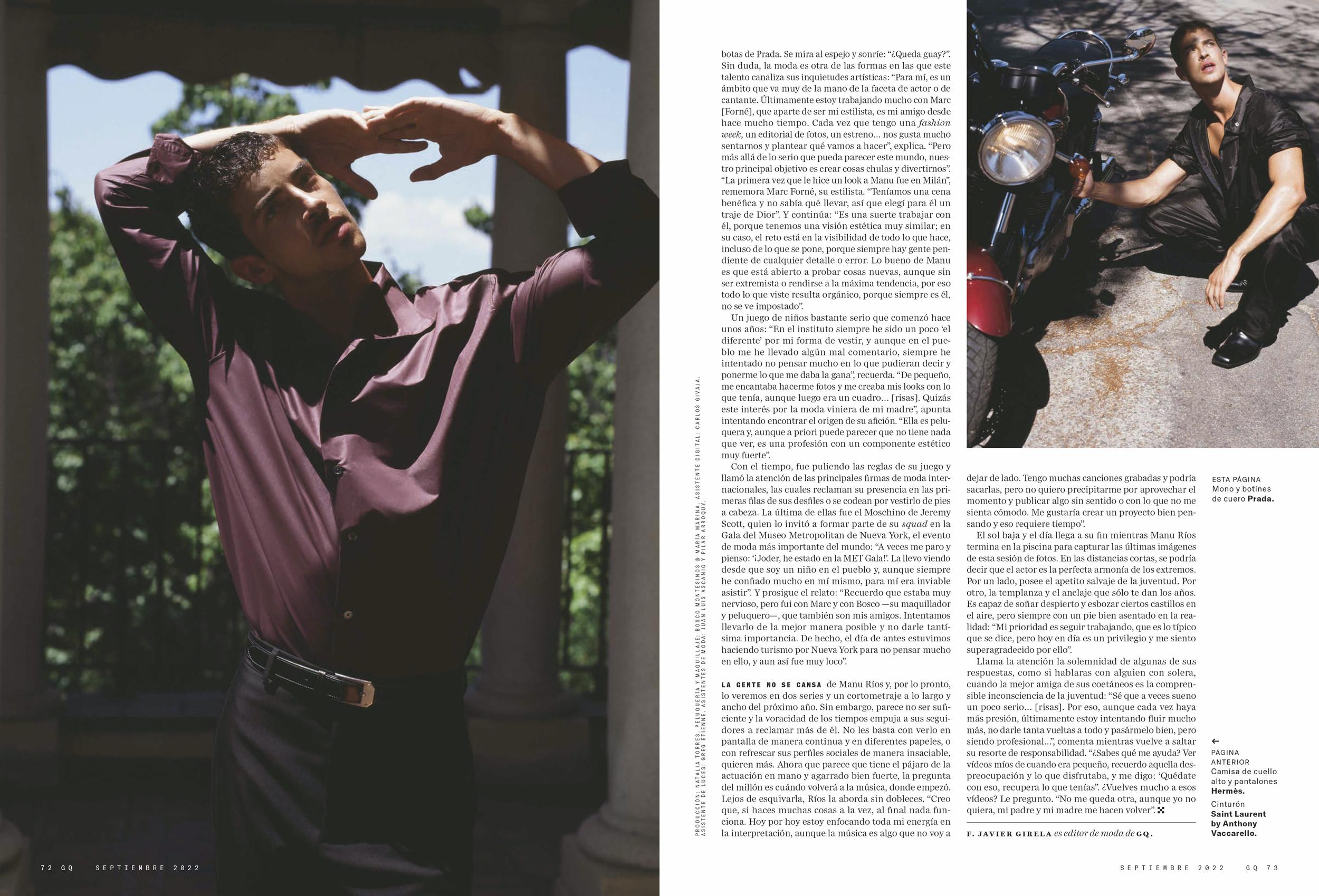
Small Caps & All Caps: Small Capitals are good for subheads or the first line of a paragraph. Text set in All Caps should be used in short headlines or subheads. All Caps should never be used for long sentences and emphasis.
Special-Purpose Style: Many formatting styles exist within the software for making footnotes, references, and mathematical formulas. These tend to be embedded or nested within the tool sections, and a lay user may not know its functions.
Text Scaling: Some programs allow the user to create a pseudo-condense or pseudo-extended font horizontally or vertically by squeezing or stretching a font. This distorts the original design of the font. You should never do this; it distorts the font and makes the messaging appear cheap.
Outline & Shadow: Another style that tends to be abused a lot is the outline or shadow style. This happens when deluded individuals, through a flick of a mouse, and the aid of software, think they can do magical things. It takes many years of practice and many more years of experience before one can format text beautifully and effectively. Please avoid outline and shadow as far as possible.
Type Size, Line Length, and Line Spacing
1) Type Size
The text flows easily when type size, line length, and line spacing are in harmony (line spacing or leading). When one of them is off, even well-designed fonts lose legibility. A type column is 50-65 characters wide. Too much type per line makes the material hard to read. Hard-to-read font may not be read.
2) Line Length
Line spacing depends on font size and line length. The line length for font size is shown below. 50 characters per line. This is the recommended column length for text. A type column is 50-65 characters wide. Too much type per line makes the material hard to read. Hard-to-read font may not be read.
3) Line Spacing
Leading is the gap between type lines. Like font size, there are no defined guidelines for line spacing, although there are certain aspects to consider:
- Some typefaces need additional line space to avoid hitting ascenders and descenders.
- Longer lines need extra leading for readability.
- Larger type requires larger line space. This guideline applies to body content; headlines may have narrower line spacing.
Character & Word Space
Typing text and set font, size, and line spacing is often enough. Extra care is required depending on the program. Larger font sizes need adjusting character spacing and paragraphs to minimize "widows" and "orphans."
Kerning: Inter-character space makes the text seem better. Most word processors do not enable kerning changes, and most page-layout tools handle it automatically. However, specific letter combinations may need human modifications.
Tracking: The adjustment of word spacing is called Tracking. It is similar to kerning but refers to adjusting a selection of characters, words, and spaces. Its main purpose is to make type fit a required space without altering the type size or line spacing. Tracking can be either negative, making the words closer together, or positive, making the words farther apart. Essential use for tracking is to fix single words (or 2-3 short words) at the end of a paragraph (sometimes called orphans or danglers).
Word spacing factors that determine correct word spacing include typeface, which is chosen, and the size and weight of the type. Consistent word spacing provides an even typographic "color", a term referring to the overall lightness and darkness of the text.
Alignment
Flush left and ragged right create a consistent letter and word space, and the reader can readily discover each new line. This aligns the text legibly. Flush right and ragged left alignments made it hard to identify new lines. This strategy is best for little bits of text. When used sparingly, centered text looks official. This should not be used for vast volumes of text. Justified text may be pretty legible if the designer provides uniform word spacing and no "rivers" disrupt the text flow.
Paragraph Spacing
Paragraph Spacing is an automated spacing between paragraphs that may be imposed above or below the paragraph. Paragraph spacing is classier than double-spacing returns.
Paragraph Indent
Indents have numerous functions, including adding design to a page. The most frequent indent is at the beginning of each paragraph. First-line paragraph indents should only be used if there is no paragraph spacing since they tell the reader when one paragraph ends and another starts. Indenting and spacing between paragraphs are excessive. Indentation equals type size. For example, a 12-point font requires a 12-point indent. (Most applications accept "p12" or "12 pt" for point sizes.) Design-wise, you may expand the first-line indent. Widows and orphans are single lines of text at the top and bottom of a page or column, respectively.
Special Formatting
Hyphens are usually used only to divide words or numbers, but they also are used to break words from one line to the next. Headlines and subheads should never be hyphenated at a line ending.
Dashes come in two varieties: the en-dash and the em-dash. En-dashes are slightly longer than hyphens (usually, the width of the letter "N") and are used to separate ranges of items, such as dates, quantities, and times. As a rule, if you can substitute the word "to" or "through".
Drop caps are used to start new chapters and special sections of a report. You can create the cap and then alter the font, the style, and the color of the character through a Character style. Many programs have settings to create drop caps automatically; if the program does not have automatic settings, drop caps should be avoided.
One sure sign of an inexperienced typographer is using "desktop" quotes. These are straight slashes that are "relics" from typewriter fonts. Luckily, most programs have automatic settings to convert these slashes to quotes. Quotes come in two varieties, each with an open and closed version.
A sidebar is a text that accompanies the main body copy. It is usually an added description that has some relation to the main narrative but is not important enough to be part of it. It is sometimes used to highlight alternate narratives or facts or to describe an image used alongside the main body text in line with the sidebar. It is a good practice to maintain a leading similar to the main body text despite the smaller font size.
The grid divides a two-dimensional plane or three-dimensional space. Compartment sizes may vary.
 |
| Figure 4.1: Raster Systeme |
Purpose of the Grid
Typographers, Graphic Designers, Photographers, and Exhibition Designers... employ the grid to solve two or three-dimensional visual challenges. By gridding the surface and gaps, the designer may effectively organize words, photos, and diagrams. This denotes orderly planning, intelligibility, and clarity. Clear and rationally organized titles, subtitles, texts, pictures, and captions are easier to read, understand, and remember. This is a scientific reality that the designer must remember.
Modular
The Grid is modular, not a straight jacket, limitation, or prison you cannot escape. The Grid allows versatility if you can see its many possibilities. These differences must be limited inside "a" book to retain its viewpoint and navigation. The book's substance is important. A book may contain text, pictures, charts, graphs, subtexts, and more. A grid organizes information so it is simple to read and comprehend.
Readability and Legibility
As designers, we are responsible to people who will use/interact with our work. In doing so, we automatically satisfy the client's desires, whether he realizes it or not. The Grid improves user experience. A well-executed design helps the work on the pages to speak clearly, rationally, elegantly, or beautifully. Turning pages and being pleasantly surprised increases interest, retention, and comprehension. The Grid is like the unseen framework underneath a gorgeous building— you do not see it, but it is there.
2. Colour
3. Image
Holding the above together is the format and grid.
Variation
Avoid predictability while utilizing these three components in a grid system. You must vary the layout while preserving book-wide uniformity. This involves keeping some sections constant, such as hang line, typography, color, and picture style, while varying element combinations and layout. This is better demonstrated than discussed. My "form and movement" workout helps with this. Variation and consistency within a grid system and format employing text, color, and image.
EXERCISES
For this exercise, we're assigned to make a mockup by exploring 3 different sizes that are bigger than A5 but smaller than A4. Below is the sizes exploration:
- 162mm x 226mm (chosen size)
- 175mm x 238mm
- 186mm x 252mm
 |
| Fig. 2.1: Book sizes exploration |
 |
| Fig. 2.2: Final Book Mockup |
 |
| Fig. 2.3: Final Book Mockup (Inside) |
 |
| Fig. 2.4: Final Book Mockup (Outer part) |
 |
| Fig. 2.5: Final Book Mockup (Close-up view) |
 |
| Fig. 3.1: Signature Fold |
 |
| Fig. 3.2: Signature Fold (Unfolded) |
 |
| Fig. 5.1: Online Magazine |
 |
| Fig. 6.1: Black&White (one color) Thumbnail |
.jpg) | |
|
FEEDBACK
REFLECTION
FURTHER READING
.png)


Comments
Post a Comment